I am not a fan of modern art. One of my earlier experiences with it was going to the Museum of Contemporary Art in Chicago at the age of twelve. I recall walking into one museum room and seeing a faded orange rag. This was the sort of cloth we might put in a rag pile and use for cleaning, and here it was displayed on a wall for all to marvel at. Not far from that was a canvas painted entirely in black paint; just completely black paint. Now, there is certainly the common question of whether it constitutes art if anyone could do it; however, this isn’t my primary question. If one potential goal for art is to invoke feelings, what kind of emotion or experience can art like this possibly cause? Certainly, there are exceptions, but generally, I avoid art made after the 1940s.
That said, both B and I independently thought that the Singapore Museum of Art was one of the most interesting modern art museums we’ve ever visited. It had exhibits from artists across Asia, each with extensive explanations. Rather than describing how much we liked it, I’ll describe what we saw, and you can judge for yourself:
- A series of panoramic photos arranged in a row, like a long comic strip. At one angle, you only see the background (a Pakistani street), but at another angle, you can see the photographer herself walking through the street. It reminded me of the shiny optical illusion cards from my childhood, in which looking from the left or the right showed you a different picture. More Info
- A series of photographs that forced political action. A Taiwanese photographer noticed a large number of abandoned buildings in her province, built by politicians giving contracts to companies that helped get them elected. The photos themselves weren’t much, but the exhibit exposed the graft and got leaders to start using the buildings to serve the community. There was also a video showing one of these buildings live and how it had negatively impacted local people who farmed oysters; this was more interesting to me. More Info
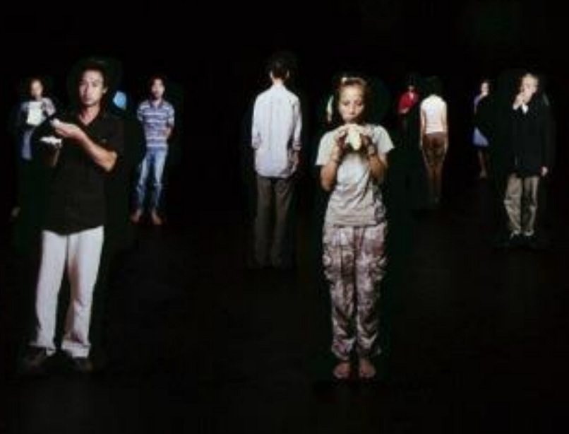
 [A favorite of A’s] A room full of larger-than-life-size people cutouts. On each one is projected a video of a Vietnamese artist eating a food of his or her choosing. It is as random as it sounds, but also cool to stand in front of one and watch the life-like person in front of you in a private moment. More Info
- A small room was decorated like a snowy expanse, out of which stuck out a jagged knife covered in blood. It turns out that this is one way to catch a wolf: he is attracted to the blood and begins licking it, tearing up his tongue; because the knife is frozen from the cold, he doesn’t feel it, and thereby bleeds to death. This was very disconcerting and uncomfortable for me, though certainly memorable. More Info
- A video of a man with his mouth forcibly held open, into which a melting heart-shaped thing dripped. I have to presume that it was a cream-colored food of some sort, though I have no way of knowing. It was intended to engender empathy for the man, in turn making people like him – and his race (Asian) more. As B pointed out, there seemed to be other, perhaps more effective ways of doing this. More Info
- A new animal species made out of metal. It had big appendages coming out of it that moved around (through electricity, I think), making it look alive – but its head was a skull, making it look dead. More Info
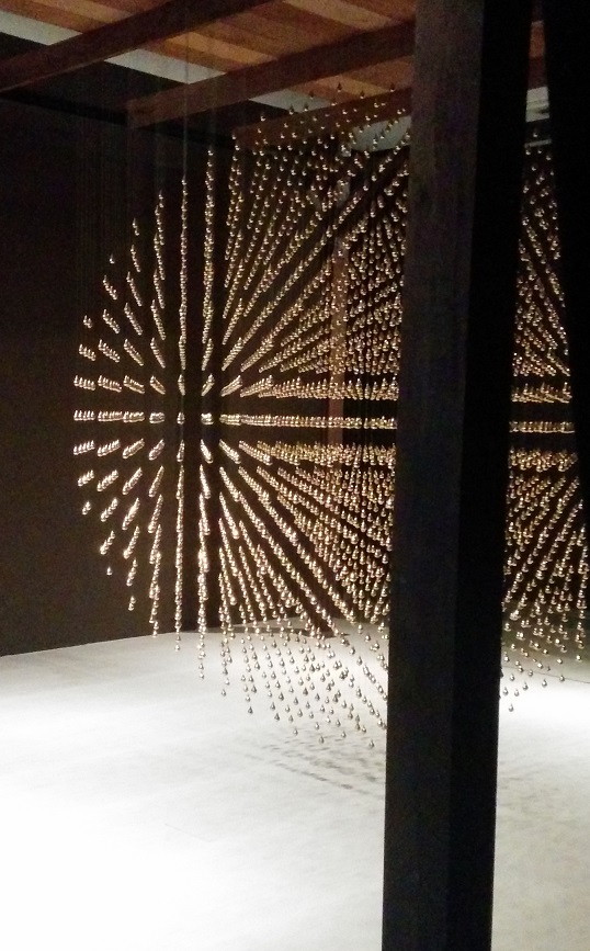
 A video on the history of a local ‘tear drop’ dessert, while watching someone make it. The story was somewhat tragic and non-linear, and there was even a metal shape made out of tiny tear drops next to it. More Info
- Two ‘learning’ rooms, in each of which the guide was very friendly and engaging: we talked for fifteen minutes each! The focus of all the exhibits was Singapore. I learned about the local housing system by designing my own apartment with stickers and by looking at posters playfully mocking the housing system. My favorite piece was the animation showing a full apartment, with one person in each room: a mom washing dishes, a dad fixing something, a son on his computer, a little girl playing, a grandma doing something, etc. Their activity was all so isolated that it underscored how much we operate in our own worlds. More Info
- [A favorite of B’s] A video of people lying in a quasi-graveyard, quasi-battleground that reminded me of a scene of the barricades from Les Miz. The video showed some of them being re-animated, and it had eerie background music that got louder to the point that I had to leave: it sounded like people dying and screeching. B liked this one a lot, and his description would likely be more comprehensive and certainly more positive.
- [A favorite of B’s] A video of a woman dancing on butter. The food was of particular meaning to her because she found a lot of it used in dishes when she moved from Indonesia to Germany – and because of which she gained a lot of weight. She was quite determined, getting up when she fell, though it did get harder to watch.
- A video of a man whose village had been destroyed by rising water levels. This was too depressing for me, but B watched the whole thing and liked it. More Info
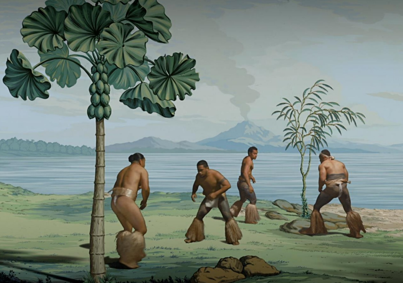
 [A favorite of both of ours] A small room with a video screen showing life in the tropics. The idea was to animate the exotic wallpaper so popular in England in the 1800s, especially among wealthy elites. The men and women in the ‘live wallpaper’ perform dances done in Tahiti, showing a more animated version of life than the one purchased by colonialist aristocrats. Each scene moves onto and off the screen, kind of like microfiche, if you are old enough to remember that. A nice touch was the chairs in front of the video screen, which were fancy ones that might belong in a British drawing room. More Info
- A room full of destroyed charcoal, and the dress the artist wore while destroying it. We both found this to be a waste of both natural resources and human energy, but maybe we’re missing something. More Info
- A black-and-white video of a bedroom was shown on back-to-back screens: one showing one part of the room and the back showing another. B had a meta experience with this one, as girls took selfies of themselves with the video projection. More Info
- There was entire collection of pieces around the theme of combining art formats, called ‘Medium at Large.’ This included things like a giant suspended wig, which was a commentary on silly fads in beauty like Indonesian girls’ desire for a hairstyle called ‘the shaggy.’ There was also a miniscule frame, in which the picture was dust from a very old artwork. B liked a painting on which a video animation was projected. There was also a huge painting/sculpture with paint splatters that B liked more than I did.
Not everything was a hit, but we found several of the pieces unusual and either visual or conceptually interesting – or both. What do you think?


Pingback: What We Saw in Singapore - Novelty Buffs
Pingback: The Best Place in the World - Novelty Buffs